A monthly data visualization challenge from the Storytelling with Data community.
The #SWDchallenge provides an excellent opportunity to experiment with new visualization techniques, receive feedback, and engage with the data storytelling community. Each month features a new topic—from specific graph types to storytelling approaches—with one week to create and share your work.
More information available at the SWD Community Challenge Page.
A look at the R ecosystem I use to transform raw data into insights:
- Core:
tidyverse(dplyr, ggplot2, tidyr) for data manipulation and visualization. - Typography & Styling:
showtextfor custom fonts andggtextfor markdown-enhanced labels. - Layout:
patchworkfor multi-plot compositions andherefor robust file path management. - Formatting:
gluefor dynamic labeling and custom R scripts for summary visualizations.
Connect with me and see my latest work:
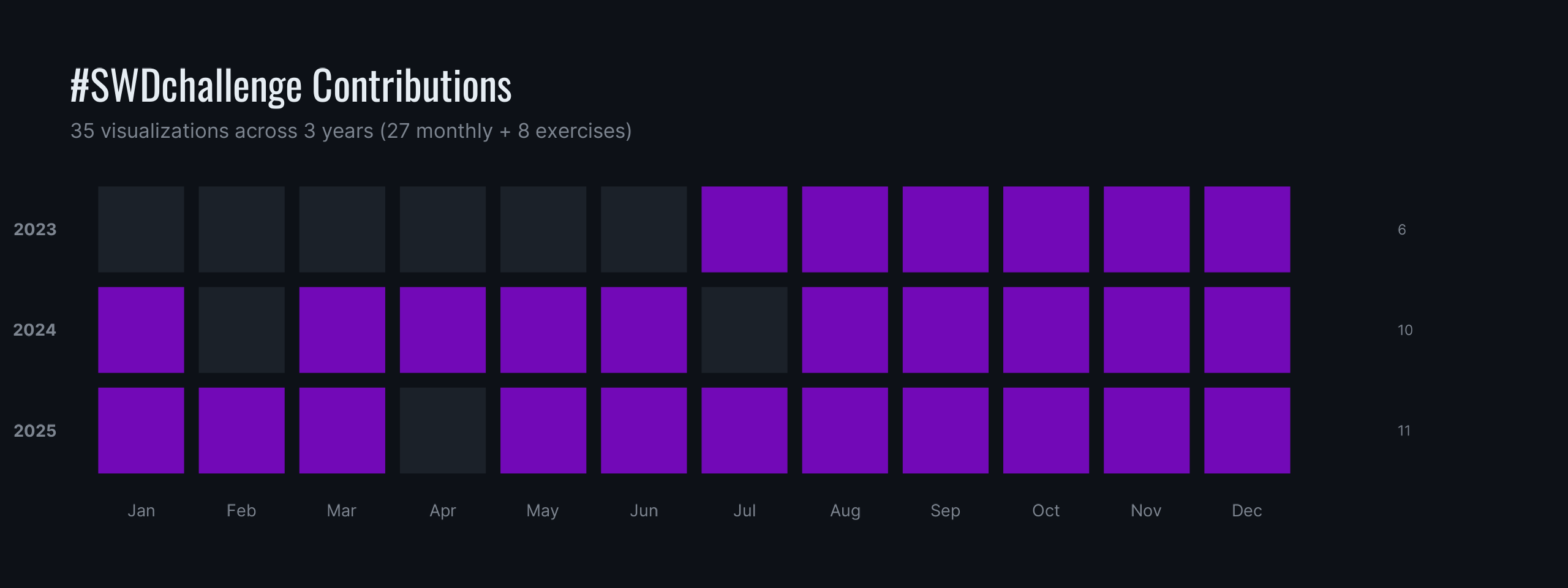
| Year | Status | Progress |
|---|---|---|
| 2025 | 🏁 Completed | 11 / 12 months |
| 2024 | 🏁 Completed | 12 / 12 months |
| 2023 | 🏁 Completed | 11 / 12 months |
The heatmap below reflects my monthly consistency across the years.