Out-PingStats is a graphical version of ping designed for long-term monitoring. It visualizes your connection either to another host or to the Internet. It offers both second by second real-time graphs and minute by minute statistics for response time, packet loss, and jitter. When evaluating Internet connection quality, it runs multiple pings in parallel for reliable assessment. It's written in powershell, and although it's graphical it still runs on your terminal.

# download
cd $Env:USERPROFILE; iwr -useb https://raw.githubusercontent.com/ndemou/Out-PingStats/main/Out-PingStats.ps1 -OutFile Out-PingStats.ps1
# run
powershell -exec bypass -c "$Env:USERPROFILE\Out-PingStats.ps1"
# download
cd $Env:USERPROFILE; iwr -useb https://raw.githubusercontent.com/ndemou/Out-PingStats/main/Out-PingStats.ps1 -OutFile Out-PingStats.ps1
# run
powershell -exec bypass -c "$Env:USERPROFILE\Out-PingStats.ps1 $(read-host 'Enter host to ping')"
- Notice the keyboard shortcut shown at the end of the graph titles. You can use these shortcuts to hide and show the graphs.
- Hit Ctrl-S to toggle betweeen the two possible graph resolutions and keep whichever looks better. You will get good enough graphs without configuring anything but if you spent a few minutes you will get production quality graphs (details follow).
Looking at the raw output of ping for more than a few seconds is tiring. A quick glance at the screen of Out-PingStats gives you a lot more information that is also easy to comprehend (packet loss, max RTT times, jitter).
To evaluate the uplink quality you can ping google.com or some other well known host. However, any host, even a robust one like google.com, may experience issues or throttle your pings. Out-PingStats pings four well known hosts in parallel, so if you see packet loss or high response times, you can be pretty certain that the issue lies either on your infrastructure or your ISP.
        +---------+               }
        | Your PC |               }
        +---++----+               }
            ||                    }
   +--------''-------------+      }
   | Your network WIFI/LAN |      }  if Out-PingStats
   +--------,,-------------+      }  shows a bad connection
            ||                    }--the problem is most
        +---''---+                }  likely somewhere
        | Router |                }  around up here...
        +---,,---+                }
            ||                    }
   +--------''----------+         }
   | Your ISP's network |         }
   +--------,,----------+         }
            ||                    }
          .-''~-.          host4
  .- ~ ~-(       )_ __      /
 /                     ~ -./        ...because all 4
|      The Internet         \       hosts down here
 \                         .'       having a problem
   ~- . _____________ . -~  \       at the same time
     /        |              \      is most likely
    /         |             host3   not the case
  host1      host2
Out-PingStats can nicely display several minutes or hours' worth of data in one screen, making it easy to assess the long term quality of a connection. It also saves its screen every 2 minutes in your %TEMP% folder so that you don't loose the results even if you accidentaly close its window. Check the saved screens with ls $env:TEMP\ops*.screen and view any of them with cat ops.2023-05-14_15.34.46.screen. Simple and helpful :-)
Wondering how close to ethernet performance your Wi-Fi can give? Run Out-PingStats, spend plenty of minutes with both and enjoy the results:

On the left terminal we are pinging our gateway. Initially via ethernet and then via Wi-Fi.
At the same time on the right terminal we've let Out-PingStats evaluate our uplink.
Seeing the output it is obvious that your Wi-Fi isn't good for VoIP or gaming.
# To test Internet quality
Out-PingStats

# To test network connection to 10.1.1.1
Out-PingStats 10.1.1.1

# To test network connection to 10.1.1.1 by pinging at 20 pings per second:
Out-PingStats -PingsPerSec 20 10.1.1.1

# In all cases you can add -HighResFont $true and you MAY get preatier graphs
If you want to evaluate your connection to a specific host
(e.g. when you want to test your ethernet/WIFI quality)
you specify the host with -Target and maybe also set
a higher ping rate (with -PingsPerSec).
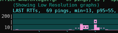
The LAST RTTs graph at the top shows one bar for every ping.
It's a bit better than looking at the raw output of ping.exe.
Timeouts/lost packets will appear as a bar of red stars:

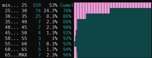
The RTT HISTOGRAM includes the most recent few hundred pings. If you don't know what a histogram is take a look at wikipedia, it's a very interesting way of representing a group of measurements. In any case you will need some experience with this graph to get a feeling of what is normal and what is not but I think it worths the time spent. Take a look at the examples below for a quick start.
The bottom graphs present aggregated values over an interval of 2 mins.
So each bar represents some indicator of network quality that is computed
for a fixed period of several seconds.
The period is by default 2 minutes but can be changed with -AggregationSeconds.
In the x-axis you get a tick every 10 periods (so by default 20 mins ).
For all graphs the lower the better
LOSS% is the percent of lost pings during the period.
ONE-WAY JITTER is half the two-way jitter. (we thus aproximate the one-way jitter by assuming that any delays are symetrical). The jitter graph will not show jitter over 30msec because that's the limit for VoIP that doesn't suck :-)
RTT 95th PERCENTILE = AlmostMax(RTT) for the period. Almost Max is the 95th percentile (p95) of RTTs. In simple words, during a period, 95% of RTTs were less or equal to this value. (See bellow for more info).
We use the 95th percentile instead of the maximum as a better indicator of bad RTT times that we have to deal with most of the time. This is usualy (but not always) a good approximation of our feeling of a line. You may, for example, have 119 pings below 20msec and one at 820msec during a 2 minute period. If ploted, that 820msec outlier, will skew the scale of your plot extremely while, at the same time provide little information on the quality of the line during that 2min period. As a counter example gamers may care about the real max because even 1 or 2 cases of a really bad RTT at the wrong time may be quite noticable. So the selection of the 95th percentile is rather arbitrary; more the result of intuition & taste than of knowledge & investigation.
Copy the following unicode block caharacters ▁▂▃▄▅▆▇█ and paste them in your
terminal. If they are displayed as shown here then you can add the -HighResFont $true
option to get preatier and more detailed graphs. If instead you get funny characters
(like these  )
then the font of your terminal does not contain unicode block characters.
"Courier" and "Consolas" do not include them, "DejaVu sans mono" does.
)
then the font of your terminal does not contain unicode block characters.
"Courier" and "Consolas" do not include them, "DejaVu sans mono" does.
If you don't force high or low resolution by using the -HighResFont $true/$false option
the code will try to detect the font and decide whether to use the unicode block characters.
It will display this warning if it thinks it can not.
If you want to setup your terminal for high-res graphs, this is the TLDR guide:
- download the zip file for the free "DejaVu sans mono" font.
- Open the zip file.
- Double-click the file
DejaVuSansMono.ttf(inside thettffolder). - Click install.
- Configure your PowerShell terminal to use the newly installed font. (You may need to signout/signin if changes are not effective). Here are the steps for Windows Terminal:
- Open Windows Terminal.
- Click on the dropdown icon on the title bar.
- Select Settings.
- Select the shell of your choice on the sidebar.
- Click Appearance.
- In the Font Face type Deja Vu Sans Mono.
- Click Save.
- Reopen Windows Terminal.
- Add the
-HighResFont $trueargument if Out-PingStats does not automatically detect the availability of the new font.
Every time Out-PingStats updates the slow graphs, it dumps the screen to a file
named ops.<START-TIME>.screen inside your %TEMP%
folder. So if after closing the program you want to view its last output
you only have to cat this file.
Out-PingStats also records every RTT time measured to a text file named
ops.<START-TIME>.pingrec in your %TEMP% folder. The file has one line per
minute starting with the timestamp hhmm:. After the timestamp follows one
character per measurement. The character is [char]($RTT+34)
(e.g. A for 31msec, B for 32msec, etc). For lost pings you get an ! instead.
-PingsPerSec N     (Pings per second - ignored when no host is specified)
-Title "My pings"   (by default the host you ping)
-GraphMax 50 -GraphMin 5    (by default they adjust automatically)
-AggregationSeconds 120    (the default)
-BucketsCount 10    (the default)
-UpdateScreenEvery 1    (the default)
-HistSamples 100    (the default)
-BarGraphSamples 20    (by default fills screen width)
-HighResFont $true   (read above Re: fonts)
-PingsPerSec is ignored in the default mode of operation (i.e. when you don't specify a host with -target).
Note that if you set this too high (e.g much more than 10) there are 2 gotchas:
A) Code that renders the screen is rather slow and ping replies will pile up (when you stop the program, take a note of "Discarded N pings" message. If N is more than two times your PingsPerSec you've hit this issue)
B) The destination host will drop some of your ICMP echo requests(pings)
When checking internet quality this script tries hard to be resilient to problems of specific hosts. To that end it will run 4 ping jobs in parallel pinging 1.1.1.1, 1.1.2.2, 8.8.8.8, and 8.8.4.4. If at least one reply is received at a specific second we consider it a success and we only take the minimum RTT into acount. We also use a smart algorithm to "normalize" the RTTs of different servers so that we don't see jitter due to the differences between the RTTs of the different servers.
At times when we are reading the RTT from one and then from another host with different average times it will appear as though there is jitter. To minimize this effect we use this method:
- Keep a record of the last N successfull RTTs from each host.
- Calculate the min of all these RTTs.
- Calculate a baseline value that follows the minimum of all these minimums slowly (we increment or decrement it by 1 or 2 msec per sample except if its difference to the real value grows too much in which case we make one big jump).
- Adjust the real RTT values by moving them towards the baseline by as many msec as their min is away from the average min.
Note that since we adjust the real RTTs by an amount that depends on a slow changing value their variability/jitter is only slightly affected. Note also that MultiPings is reporting to main code just one RTT value from all hosts (the min RTT). Then the main code calculates the jitter based on this artificial/agregate RTT value. I think that this is better than taking the jitter for every host.


(This example is from an older version where the 95th percentile was split in two different graphs,
one for the minimum and one for p95-min. It was more informative but less intuitive)
