Text area
Shows a dataprovider in a multiline editable text box.
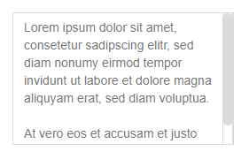
Table of contents
The component has the following properties:
| Property | Type | Default | Description |
|---|---|---|---|
| dataProvider | dataprovider | The column or variable to provide the data for this field | |
| editable | Boolean | true | Whether the field is editable or not |
| enabled | Boolean | true | Whether the field is enabled ot not |
| placeholderText | String | An optional placeholder text shown when no value is set yet (i18n supported) | |
| tabSeq | Number | Tab sequence index of the form | |
| tooltipText | String | Tooltip text shown when hovering over the calendar (i18n is supported) | |
| visible | Boolean | Whether the component is visible or not |
The component allows to attach handlers for the following events:
| Event | Parameters | Return | Description |
|---|---|---|---|
| onAction | event:JSEvent | Fired when the enter key is hit | |
| onDataChange | oldValue:Date, newValue:Date, event:JSEvent | Boolean | Fired when the value is changed |
| onFocusGained | event:JSEvent | Fired when the calendar gets focus | |
| onFocusLost | event:JSEvent | Fired when the calendar loses focus | |
| onRightClick | event:JSEvent | Fired when the user right clicks |
The component has no API methods.