English | 简体中文
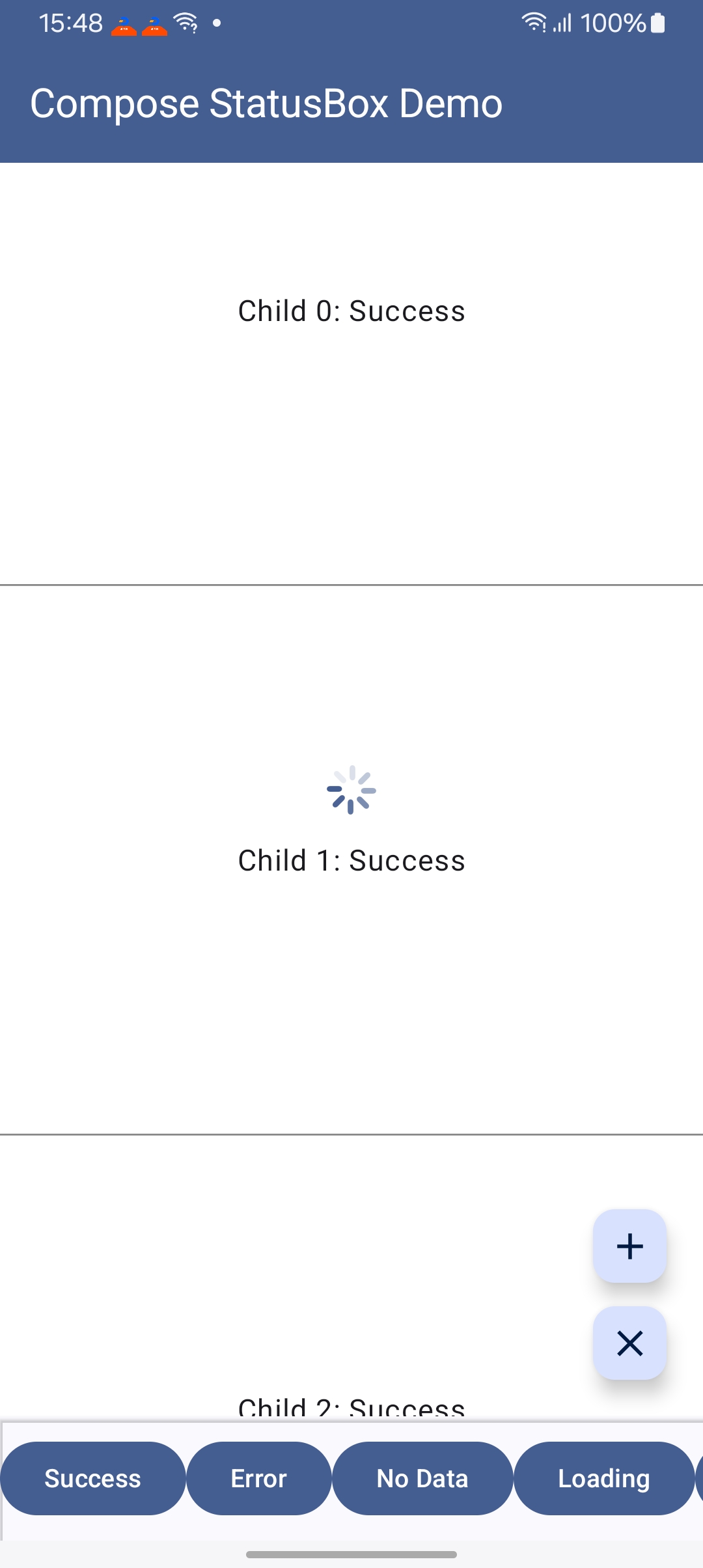
一个优雅的 Kotlin Multiplatform Compose 库,帮助您轻松处理页面的不同状态:初始化、加载中、成功、失败、无数据等。

- 🎯 声明式 UI:使用 Compose 的声明式语法,优雅地管理页面状态
- 🌍 全平台支持:支持 Android、iOS、Desktop (JVM)、Web (Wasm/JS)
- 🎨 高度可定制:支持全局配置和局部自定义状态组件
- 🔄 类型安全:通过泛型和密封类确保类型安全
- 📜 Paging 集成:内置 Paging3 支持,轻松实现列表分页加载
- 🪶 轻量级:核心库体积小,无额外依赖
- 📦 开箱即用:内置默认状态视图,快速上手
在 build.gradle.kts 中添加 JitPack 仓库:
repositories {
    maven("https://jitpack.io")
}
添加依赖:
kotlin {
    sourceSets {
        commonMain.dependencies {
            implementation("com.github.OCNYang.compose-status-box:compose-status-box-kmp:2.0.3")
        }
    }
}dependencies {
implementation 'com.github.OCNYang.compose-status-box:status-box-library-android:2.0.3'
}✅ Build artifacts:
com.github.OCNYang.compose-status-box:status-box-library-android-debug:2.0.3
com.github.OCNYang.compose-status-box:status-box-library-android:2.0.3
com.github.OCNYang.compose-status-box:compose-status-box-kmp:2.0.3
com.github.OCNYang.compose-status-box:status-box-library-desktop:2.0.3
@Composable
fun MyScreen() {
    var uiState by remember { mutableStateOf<UIState>(UIState.Initial) }
    var loading by remember { mutableStateOf(true to null) }

    StatusBox(
        modifier = Modifier.fillMaxSize(),
        uiState = uiState,
        loadingState = loading
    ) {
        // 你的成功状态内容
        Text("数据加载成功!")
    }
}// 定义自定义成功状态
sealed interface MyUIState : UIState {
data class Success(val data: List<String>) : MyUIState
}
@Composable
fun TypeSafeScreen() {
var uiState by remember { mutableStateOf<UIState>(UIState.Initial) }
var loading by remember { mutableStateOf(false to null) }
StatusBox(
modifier = Modifier.fillMaxSize(),
uiState = uiState,
loadingState = loading,
successStateTransformFun = { state ->
if (state is MyUIState.Success) state else null
}
) { successState: MyUIState.Success ->
// 类型安全:successState 保证是 MyUIState.Success 类型
LazyColumn {
items(successState.data) { item ->
Text(item)
}
}
}
}StatusBox(
uiState = uiState,
loadingState = loading,
// 自定义初始状态
initComponent = {
Column(
modifier = Modifier.fillMaxSize(),
horizontalAlignment = Alignment.CenterHorizontally,
verticalArrangement = Arrangement.Center
) {
Icon(Icons.Default.Info, contentDescription = null)
Text("点击按钮开始加载")
}
},
// 自定义错误状态
errorComponent = { errorState ->
Column(
modifier = Modifier.fillMaxSize().clickable { /* 重试 */ },
horizontalAlignment = Alignment.CenterHorizontally,
verticalArrangement = Arrangement.Center
) {
Icon(Icons.Default.Error, contentDescription = null, tint = Color.Red)
Text(errorState.message)
Button(onClick = { /* 重试逻辑 */ }) {
Text("重试")
}
}
}
) {
// 成功内容
}StatusBox 提供了与 Paging3 的无缝集成,通过扩展函数 items() 自动处理分页加载的各种状态(首次加载、刷新、追加、前置、错误等)。
在 build.gradle.kts 的 commonMain 中添加 Paging 依赖:
kotlin {
    sourceSets {
        commonMain.dependencies {
            implementation("com.github.ocnyang:compose-status-box-kmp:2.0.0")
            implementation("androidx.paging:paging-compose:3.4.0-alpha04")
        }
    }
}items() 扩展函数支持 LazyColumn、LazyRow、LazyGrid 和 LazyStaggeredGrid,自动处理所有分页状态:
@Composable
fun PagingDemoScreen() {
    val pager = remember {
        Pager(
            config = PagingConfig(pageSize = 20, enablePlaceholders = false)
        ) {
            YourPagingSource()  // 实现 PagingSource<Int, YourDataType>
        }
    }
    val lazyPagingItems = pager.flow.collectAsLazyPagingItems()

    LazyColumn {
        items(
            pagingItems = lazyPagingItems,
            key = { it.id }  // 提供唯一 key 以优化性能
        ) { item ->
            // 渲染每个数据项
            ItemCard(item = item)
        }
    }
}适用于新闻列表、商品列表等向下滚动加载更多的场景:
LazyColumn {
    items(
        pagingItems = lazyPagingItems,
        key = { it.id }
    ) { item ->
        Card(
            modifier = Modifier
                .fillMaxWidth()
                .padding(16.dp)
        ) {
            Text(text = item.title)
            Text(text = item.description)
        }
    }
}
特点:
- 向下滚动时自动加载下一页
- 底部显示加载指示器
- 加载失败时底部显示错误提示和重试按钮
- 到达最后一页时显示"没有更多数据"
适用于聊天消息、时间线等向上滚动加载历史数据的场景:
val listState = rememberLazyListState()

// 首次加载后自动滚动到底部(最新消息)
LaunchedEffect(lazyPagingItems.itemCount) {
    if (lazyPagingItems.itemCount > 0 && listState.firstVisibleItemIndex == 0) {
        listState.scrollToItem(lazyPagingItems.itemCount - 1)
    }
}

LazyColumn(
    state = listState,
    reverseLayout = true  // 反向布局:最新消息在底部
) {
    items(
        pagingItems = lazyPagingItems,
        key = { it.id }
    ) { item ->
        ChatMessageCard(message = item)
    }
}
特点:
reverseLayout = true:列表反向布局,最新数据在底部- 向上滚动时自动加载历史数据
- 顶部显示加载指示器
- 加载失败时顶部显示错误提示和重试按钮
items() 扩展函数支持完全自定义所有状态视图:
LazyColumn {
    items(
        pagingItems = lazyPagingItems,
        key = { it.id },
        // 自定义加载视图
        loadingContent = {
            Box(
                modifier = Modifier.fillMaxWidth().padding(16.dp),
                contentAlignment = Alignment.Center
            ) {
                CircularProgressIndicator()
                Text("加载中...", modifier = Modifier.padding(start = 8.dp))
            }
        },
        // 自定义错误视图
        errorContent = { error, retry ->
            Column(
                modifier = Modifier
                    .fillMaxWidth()
                    .padding(16.dp)
                    .clickable { retry() },
                horizontalAlignment = Alignment.CenterHorizontally
            ) {
                Icon(Icons.Default.Error, contentDescription = null, tint = Color.Red)
                Text("加载失败:${error.message}", color = Color.Red)
                Button(onClick = retry) {
                    Text("点击重试")
                }
            }
        },
        // 自定义"没有更多"视图
        noMoreContent = {
            Text(
                text = "已经到底了",
                modifier = Modifier
                    .fillMaxWidth()
                    .padding(16.dp),
                textAlign = TextAlign.Center,
                color = Color.Gray
            )
        },
        // 自定义首次加载错误视图
        initialLoadErrorContent = { error, retry ->
            Column(
                modifier = Modifier.fillMaxSize(),
                horizontalAlignment = Alignment.CenterHorizontally,
                verticalArrangement = Arrangement.Center
            ) {
                Text("数据加载失败", style = MaterialTheme.typography.headlineSmall)
                Text(error.message, color = Color.Gray)
                Button(onClick = retry, modifier = Modifier.padding(top = 16.dp)) {
                    Text("重新加载")
                }
            }
        }
    ) { item ->
        ItemCard(item = item)
    }
}items() 扩展同样适用于网格布局:
// LazyVerticalGrid
LazyVerticalGrid(
    columns = GridCells.Fixed(2)
) {
    items(
        pagingItems = lazyPagingItems,
        key = { it.id }
    ) { item ->
        GridItemCard(item = item)
    }
}

// LazyStaggeredGrid
LazyVerticalStaggeredGrid(
    columns = StaggeredGridCells.Fixed(2)
) {
    items(
        pagingItems = lazyPagingItems,
        key = { it.id }
    ) { item ->
        StaggeredGridItemCard(item = item)
    }
}fun <T : Any> LazyListScope.items(
pagingItems: LazyPagingItems<T>, // Paging3 的数据流
key: ((item: T) -> Any)? = null, // 唯一 key,用于列表优化
contentType: ((item: T) -> Any)? = null, // 内容类型,用于列表优化
// 自定义加载视图(追加/前置加载时显示)
loadingContent: @Composable LazyItemScope.() -> Unit = { /* 默认加载视图 */ },
// 自定义错误视图(追加/前置加载失败时显示)
errorContent: @Composable LazyItemScope.(error: Throwable, retry: () -> Unit) -> Unit = { /* 默认错误视图 */ },
// 自定义"没有更多"视图
noMoreContent: @Composable (LazyItemScope.() -> Unit)? = { /* 默认提示 */ },
// 自定义初始加载视图(首次加载时显示)
initialLoadingContent: @Composable (() -> Unit)? = { /* 默认初始加载视图 */ },
// 自定义初始加载错误视图(首次加载失败时显示)
initialLoadErrorContent: @Composable ((error: Throwable, retry: () -> Unit) -> Unit)? = { /* 默认错误视图 */ },
// 自定义空数据视图(数据源返回空列表时显示)
emptyContent: @Composable (() -> Unit)? = { /* 默认空视图 */ },
// 自定义刷新加载视图(下拉刷新时显示)
refreshLoadingContent: @Composable (() -> Unit)? = { /* 默认刷新视图 */ },
// 数据项内容渲染
itemContent: @Composable LazyItemScope.(value: T) -> Unit
)查看 composeApp 模块中的完整示例:
PagingAppendDemoScreen.kt:底部加载更多示例PagingPrependDemoScreen.kt:顶部加载历史示例(聊天风格)
在应用启动时配置默认状态视图:
// Android
class MyApplication : Application() {
    override fun onCreate() {
        super.onCreate()
        StatusBoxGlobalConfig.apply {
            initComponent { CustomInitialView() }
            emptyComponent { CustomEmptyView() }
            errorComponent { CustomErrorView(it.message) }
            loadingComponent { CustomLoadingView() }
        }
    }
}

// iOS / Desktop / Web
fun main() {
    StatusBoxGlobalConfig.apply {
        initComponent { CustomInitialView() }
        emptyComponent { CustomEmptyView() }
        errorComponent { CustomErrorView(it.message) }
        loadingComponent { CustomLoadingView() }
    }
    application {
        // 你的应用启动代码
    }
}StatusBox 使用密封接口定义三种内置状态:
sealed interface UIState {
    object Initial : UIState          // 初始状态
    data class Error(
        val message: String,
        val throwable: Throwable? = null
    ) : UIState                       // 错误状态
    data class Empty(
        val value: Any? = null
    ) : UIState                       // 空数据状态
}

// 自定义成功状态(通过实现 UIState)
data class Success(val data: YourData) : UIState加载状态独立于 UIState,使用 Pair<Boolean, Any?> 表示:
var loading by remember { mutableStateOf(false to null) }

// 显示加载
loading = true to null

// 显示带进度的加载
loading = true to 0.75  // 75% 进度

// 显示带消息的加载
loading = true to "正在上传文件..."

// 隐藏加载
loading = false to nullStatusBox(
uiState = uiState,
loadingState = loading
) { baseState: UIState ->
// 需要手动类型检查
if (baseState is MySuccessState) {
Text(baseState.data)
}
}StatusBox(
uiState = uiState,
loadingState = loading,
successStateTransformFun = { state ->
if (state is MySuccessState) state else null
}
) { successState: MySuccessState ->
// 自动类型安全,无需类型检查
Text(successState.data)
}StatusBox(
modifier: Modifier = Modifier,
uiState: UIState, // 当前 UI 状态
loadingState: Pair<Boolean, Any?> = false to null, // 加载状态及额外数据
loadingBlockPress: Boolean = false, // 加载时是否阻止点击
initComponent: @Composable (() -> Unit)? = null, // 初始状态组件
emptyComponent: @Composable ((UIState.Empty) -> Unit)? = null, // 空数据组件
errorComponent: @Composable ((UIState.Error) -> Unit)? = null, // 错误组件
loadingComponent: @Composable ((Pair<Boolean, Any?>) -> Unit)? = null, // 加载组件
successStateTransformFun: ((UIState) -> T?)? = null, // 成功状态转换函数
content: @Composable (T) -> Unit // 成功状态内容
)StatusBox 提供了开箱即用的默认状态视图:
- DefaultInitialStateView:空白初始视图
- DefaultEmptyStateView:包含图标和提示文本的空数据视图
- DefaultErrorStateView:包含错误图标和消息的错误视图
- DefaultLoadingStateView:Material Design 风格的加载动画
| 平台 | 支持状态 | 备注 |
|---|---|---|
| Android | ✅ 完全支持 | minSdk 24, targetSdk 35 |
| iOS | ✅ 完全支持 | arm64, x64, simulatorArm64 |
| Desktop (JVM) | ✅ 完全支持 | Windows, macOS, Linux |
| Web (Wasm) | ✅ 完全支持 | Chrome 119+, Firefox 120+, Safari 17.4+ |
| Web (JS) | ✅ 完全支持 | 传统浏览器兼容 |
- Kotlin: 2.2.0
- Compose Multiplatform: 1.7.1
- Compose BOM: 2025.08.00
- 最低要求:
- Android: minSdk 24
- iOS: iOS 15.0+
- Desktop: JVM 17+
- Web: 现代浏览器
查看 composeApp 模块中的完整示例:
# 运行 Android 示例
./gradlew :app:installDebug

# 运行 Desktop 示例
./gradlew :composeApp:run

# 运行 Web 示例(Wasm)
./gradlew :composeApp:wasmJsBrowserDevelopmentRun

# 运行 Web 示例(JS)
./gradlew :composeApp:jsBrowserDevelopmentRun欢迎提交 Issue 和 Pull Request!
Copyright 2024 OCNYang

Licensed under the Apache License, Version 2.0 (the "License");
you may not use this file except in compliance with the License.
You may obtain a copy of the License at

   http://www.apache.org/licenses/LICENSE-2.0

Unless required by applicable law or agreed to in writing, software
distributed under the License is distributed on an "AS IS" BASIS,
WITHOUT WARRANTIES OR CONDITIONS OF ANY KIND, either express or implied.
See the License for the specific language governing permissions and
limitations under the License.
如果这个项目对你有帮助,请给个 ⭐️ Star 支持一下!