[WIP]filter - filter component with checkbox select options #86
Conversation
 hyx131
changed the title
hyx131
force-pushed
the
filter
branch
3 times, most recently
from
hyx131
changed the title
hyx131
force-pushed
the
filter
branch
3 times, most recently
from
de1b8ed to
34c2635
Compare
hyx131
changed the title
hyx131
changed the title
… component itself
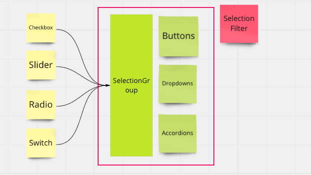
- will focus only on select option groups, not filter wrapper
…trols & row-column view
…rols & row-column view
hyx131
changed the title
|
Nice work! I have a couple of discussion points regarding the recent change. Component Hierarchy
To me, the current
Data type E.g. I need to manually change my data type from I feel that we should enforce a single data type (e.g. string) for all types of selection controls so that switching from one to another is more convenient from an end-user perspective. |
| <SelectionGroup | ||
| type='slider' | ||
| options={options} | ||
| optionsLabel='Categories' |
There was a problem hiding this comment.
I think we could just name it label?
| <SwitchGroup filterVals={filterVals} switchOnChange={checkboxOnChange} direction={direction} /> | ||
| )} | ||
| {type === 'slider' && ( | ||
| <SliderGroup direction={direction} sliderStep={sliderStep} options={options} onChange={onChange} /> |
There was a problem hiding this comment.
For now, we don't have any plans to incorporate vertical sliders. It should be always horizontal regardless of direction.
| const [filterVals, setFilterVals] = useState(options) | ||
| const [selectAll, setSelectAll] = useState(true) | ||
|
|
||
| const checkboxOnChange = (e) => { |
There was a problem hiding this comment.
I think the name of this should be changed as it is used for both CheckboxGroup and SwitchGroup
| import SliderGroup from './slider-group' | ||
|
|
||
|
|
||
| const useStyles = makeStyles(() => ({ |
There was a problem hiding this comment.
I recommend using theme.spacing prop for margins/paddings or have values that are a multiplication of 4.
Thanks, will review! |
hyx131
changed the title
[STATUS: component to be finished by @DoParkEQ from here on]
This PR initially has the goal of implementing a multi-use-case
<Filter />component (see issue #96).After discussions, goal for this PR has now changed to implementing a multi-select-group component, leaving out the outer wrapper (whether it'd be a button, or accordion, or none...) that opens up these select groups (see issue #98).
These select groups will internally manage any state change events, and will return the final state of those changes via
onChangeproperty, format of the result will depend on the select group type:(newVal) => newVal = selectedValue(newFilterOptions, selectedVals) => { newFilterOptions = [ { option1: true }, { option2: false } ] selectedVals = [ 'option1' ] }(newVal) => newVal = [min, max]