Analysis of Netflix data and it's visualization
Below is a graph displaying the null values in the dataset.

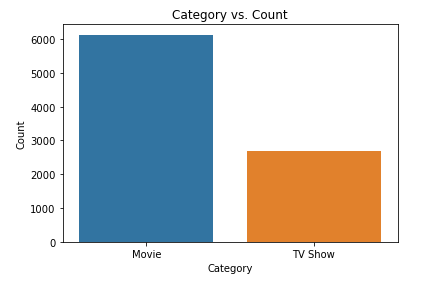
The Netflix dataset contains both movies and tv show data. Comparison of movies and tv shows is displayed in the bar graph below.
Every year tv shows and movies are being released. We can see the sudden rise in the number of releases each year.

From the pie chart below, we can see the percentage of top 7 source countries for Netflix movies and tv shows.
