proposal to swap boxplot with density plot #4
Description
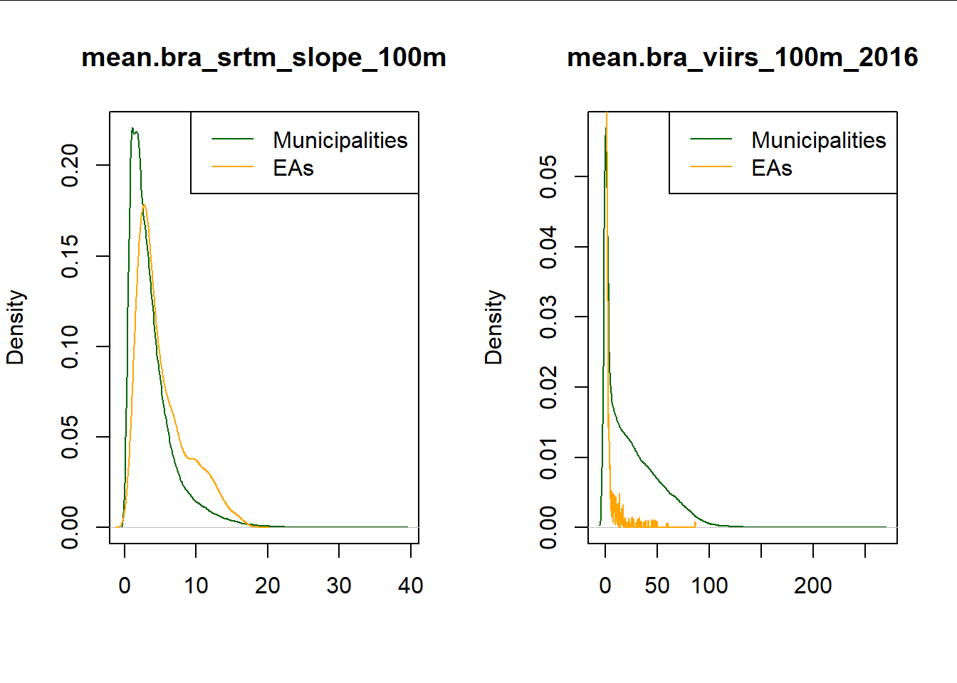
Proposal concerning the visualisation of covariates mismatch
To me, the boxplots shown are focusing our attention to the outlier observations.
Thus neither covariates seems to be correct
A substitute is proposed in this commit with density plot.
Code is already integrated:
top-down-tutorial/4_tutorial.Rmd
Line 471 in 5bb5b25