Selection control component enhancement #69
Description
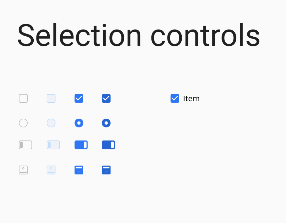
Selection control components include radio buttons, checkboxes, and switches. There are few issues need to be addressed.
StyledRadio
- disable hover state when the component is disabled.
StyledCheckbox
- disable hover state when the component is disabled.
StyledSwitch
- create two different style variations based on the proposed design.
detailed specifications are available on Zeplin.